Interactive · Data storytelling · Consulting
Early Work at Fathom
Selected data visualization projects from my time at Fathom Information Design.
Team
Fathom Information Design
Founder & Principal
Ben FryInformation Designer
Terrence FradetLead Designer
James GradyDesigner
Rachel HarrisData Architect & Visualization
Jose Garcia del CastilloWriter & Content Developer
Alexandra GellerSoftware Engineer
Mark SchifferliNational Geographic
What the World Eats
A graphic from the "What the World Eats" series on Twitter held users' attention for an average of 8 minutes.


Nike
Nike Weather
Using activity data, we mapped how people move differently across weather conditions and cities.
Design lead James Grady
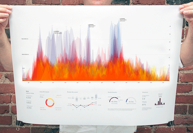
Year in Nikefuel
Every person has a unique movement pattern. I wrote code to visualize this diversity, pitched it to Nike, and they shared it with their NikeFuel community.


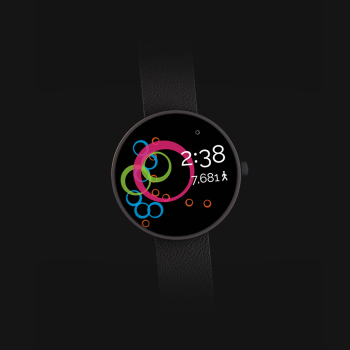
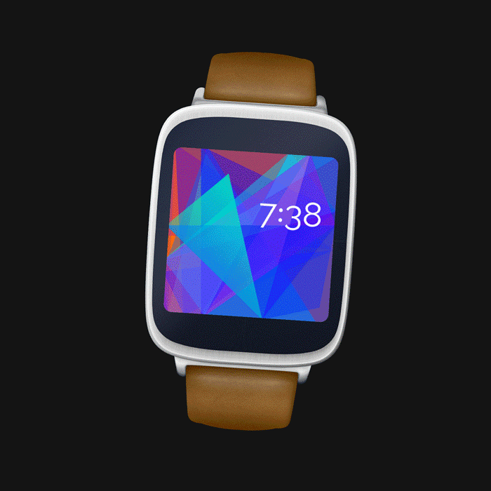
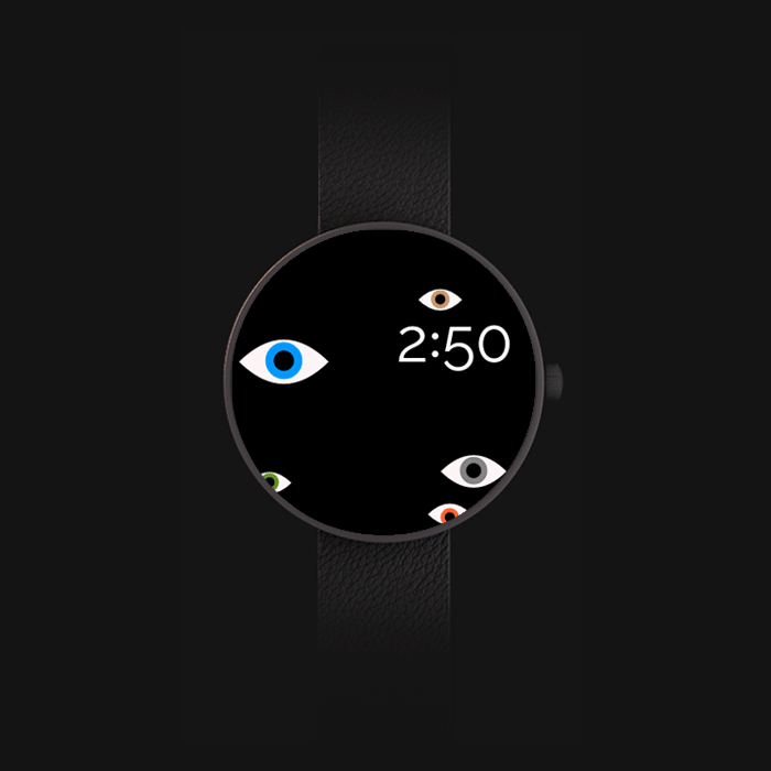
Fathom Watch Faces
Google invited Fathom to be featured in their watch face design experiments. James and I designed 3 watch faces that responded to a user's movement, daily activity, and view count.
Co-designed with James Grady
City of Boston
Urban Agriculture
I mapped Boston's urban agriculture landscape—community gardens, farms, and food access points—to help the city understand their distribution.
Illustrations by Rachel Harris
The Clinton Foundation
No Ceilings
Over six months, we explored the story of what governments value through the data they collect on gender equality worldwide.
Design lead James Grady
World Color Survey
Colorful Language
The World Color Survey gathered data from 2,696 native speakers of 110 languages, asking each participant to identify 330 different colors.

I wrote Processing code to read the survey data and try different groupings. The sketches became the final piece: blocks for each language radiating from center, ordered from most to least used term.

Mixing colors programmatically resulted in muddy hues, but relying on our own eyes produced satisfying, textured visualizations.

Comparing like colors across languages.

Poster visualization explorations.


This is how the survey tool looked and functioned.
Photo Credit: Thomas Headland
Want to see more?
Get in touch with me to see my in-depth case studies.